
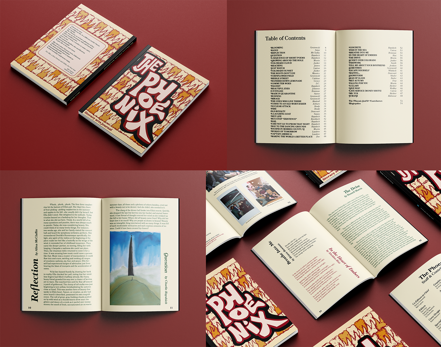
The Phoenix Literary Arts Journal 2024 print layout. Cover art by Katie Doncourt. Typography and layout on back cover and inside content by Soren DeNiz. Works compiled in collaboration with The Phoenix club at CCAC.
The Phoenix Literary Arts Journal 2024
As Lead Designer of The Phoenix Literary Arts Journal club at CCAC in 2023-2024, I was tasked with creating the cohesive design for that year's printed publication. I created the design style guides with a professional yet expressive theme through the use of serif fonts and dark green, red, and blue colors. I included sideways titles for some pieces to make the layout dynamic and energetic while sticking to a balanced grid. My colleague K-Andre Harris helped format about a third of the pages. Fellow CCAC design student Katie Doncourt illustrated the cover art, which I formatted and added the text on the back and the spine. I worked with six editors in the club staff who curated the submissions and proofread them before and after I formatted them. I formatted the final design files which I sent to the printing company and adjusted based on their specifications. This design was a finalist in the Publication category of the 2024 AIGA Flux Student Design Competition.
Starry Vincent Bottle Packaging
The assignment prompt was to fabricate a drink brand and create its packaging design. I chose to design a sparkling juice brand based on Vincent Van Gogh’s “Starry Night” painting. I based the packaging dieline on an origami pattern for a hexagonal box with a swirling closure on top. I tied the hexagonal box shape to the logo and used a script format for the logotype. I created swirl graphics in reference to Vincent Van Gogh’s “Starry Night,” which I incorporated into the printed packaging as well as cut out of adhesive vinyl on a Cricut machine. I used the same vinyl for the foil closure on top. I added mica powder in the drink so that when the bottle is swirled, the mica glitters inside, imitating the swirl graphics. The bottle labels tie in the logo and colors from the packaging at a size that is clearly legible but also lets the glittering liquid and gold swirls shine through.

Packaging design for Starry Vincent sparkling juice bottle. Created for the Graphic Communications 3 class.
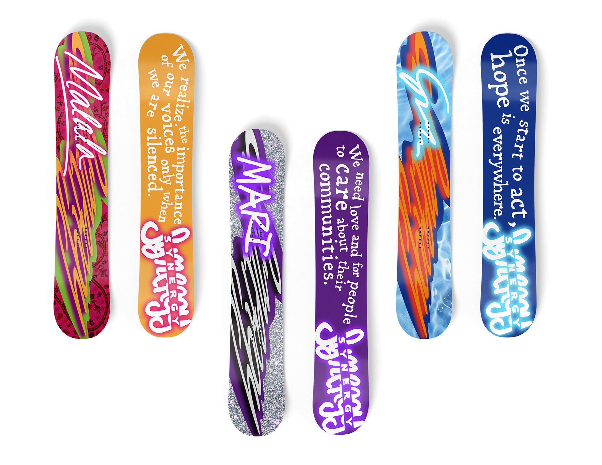
Snowboard designs for Synergy, inspired by Malala Yousafzai, Created for the Graphic Communications 2 Typography class.
Synergy Snowboards
The assignment prompt was to create a logo design for the fictional snowboard company, Synergy, and incorporate it into a design series of three snowboards. My concept targets an audience of young girls who are daring and want to change the world. My series features freestyle snowboards designed around Greta Thunberg, Malala Yousafzai, and Mari Copeny: teen activists who are strong role models and have made a global impact. Each board uses a different color palette to represent each person, including their signature on the top of the board and a quote by them on the underside of the board. The stretched Synergy logo is the base of the design for the tops of the snowboards, with color palettes and textures that tie to the corresponding activist and their personality. I hand-drew the type and laid it out organically to give it a more expressive and personalized look. I incorporated the snowboard designs into a full spread magazine ad for Synergy featuring the three teen activists.
Penn Valley Branding & Business System
For this assignment, I needed to create an abstract logo for the fictional bank Penn Valley Savings & Loans. From the information I was given, the company cares about serving a greater purpose of empowering prosperity for their employees, customers, community, and shareholders. Based on that, I chose a color palette of energetic dark and light green relating to the company’s efforts in sustainability and community success. I designed the abstract logo icon to have four teardrop shapes representing the employees, customer, community, and shareholders, forming a rounded square, with the negative space in the middle forming a smaller square. This combination of the stable and reliable profile of a square and the organic and inviting profile of the teardrop neatly encapsulates Penn Valley’s loyalty to serve a greater purpose for the community. I designed the logotype to include rounded corners on the bases of the letterforms to connect seamlessly with the icon. I created the pattern on the bottom of the stationery as well as the pattern on the back to tie those items into the branding.

Logo design and business stationery set for Penn Valley Savings & Loans. Created for the Graphic Communications 3 class.