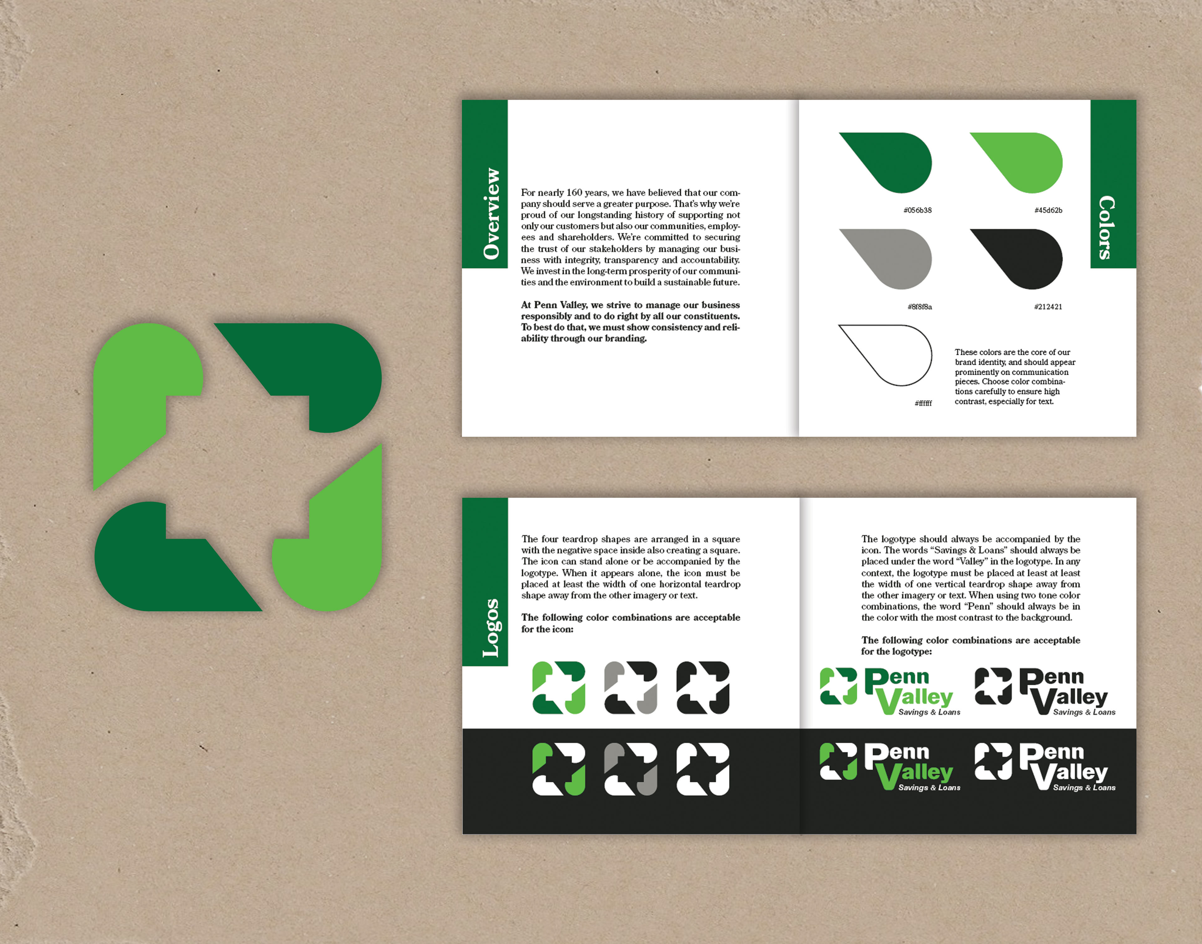
For this class assigned project, I needed to create an abstract logo for the fictional bank Penn Valley Savings & Loans. From the information I was given, the company cares about serving a greater purpose of empowering prosperity for their employees, customers, community, and shareholders. Based on that, I chose a color palette of energetic dark and light green relating to the company’s efforts in sustainability and community success.

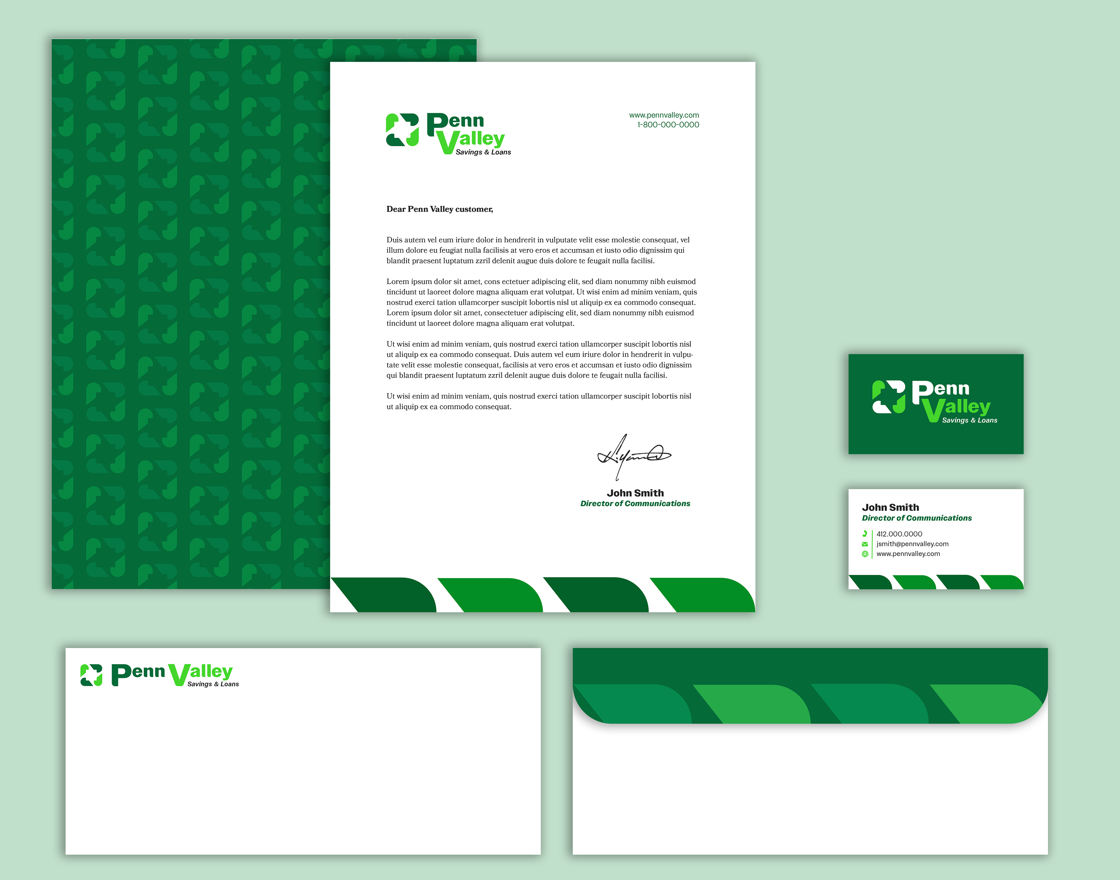
I designed the abstract logo icon to have four teardrop shapes representing the employees, customer, community, and shareholders, forming a rounded square, with the negative space in the middle forming a smaller square. This combination of the stable and reliable profile of a square and the organic and inviting profile of the teardrop neatly encapsulates Penn Valley’s loyalty to serve a greater purpose for the community. I designed the logotype to include rounded corners on the bases of the letter forms to connect seamlessly with the icon. I created the pattern on the bottom of the stationery as well as the pattern on the back to tie those items into the branding.