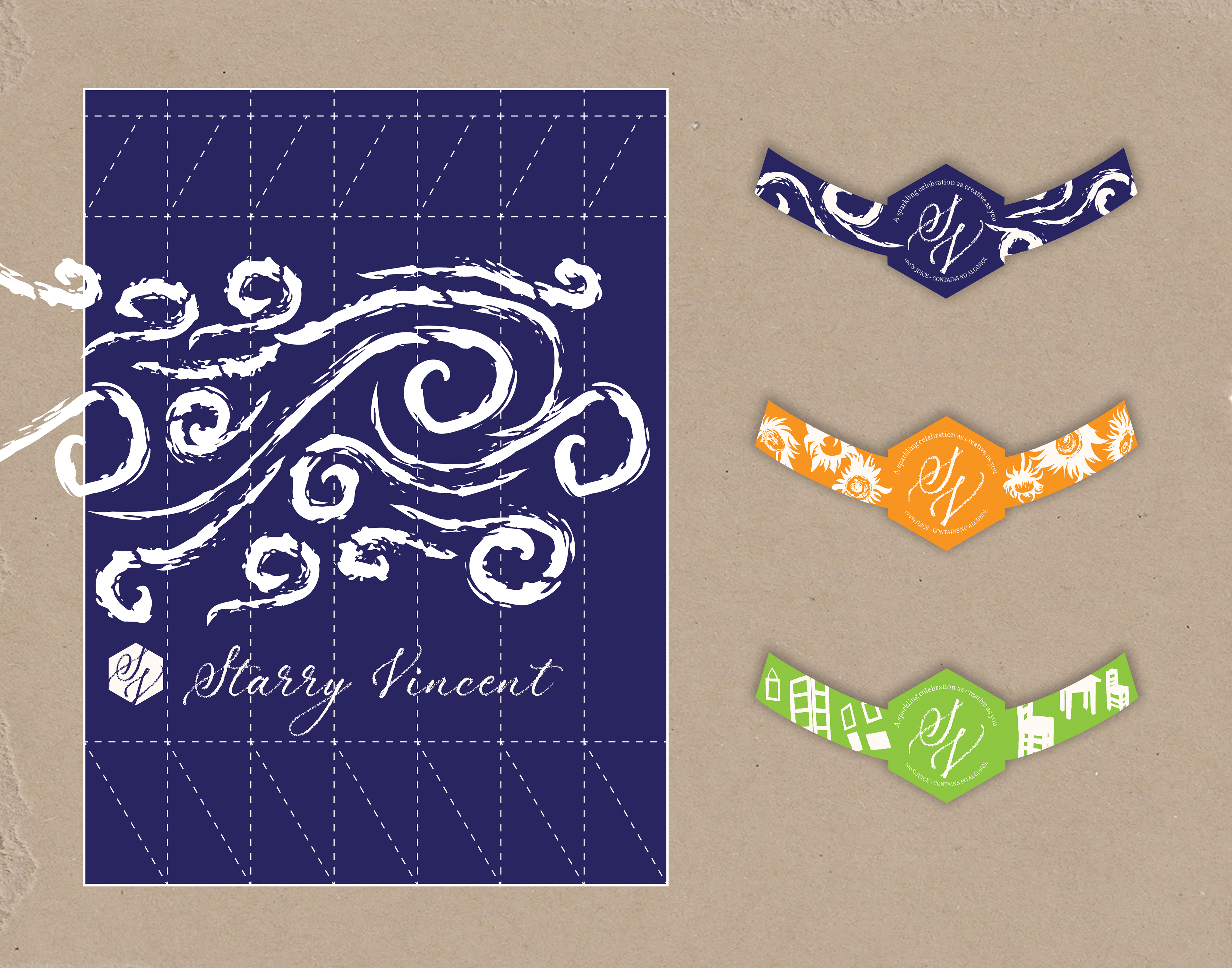
This packaging design project was created for an advanced Graphic Communications course at CCAC. The assignment prompt was to fabricate a drink brand and create its packaging design. I chose to design a sparkling juice brand based on Vincent Van Gogh’s impressionist paintings.
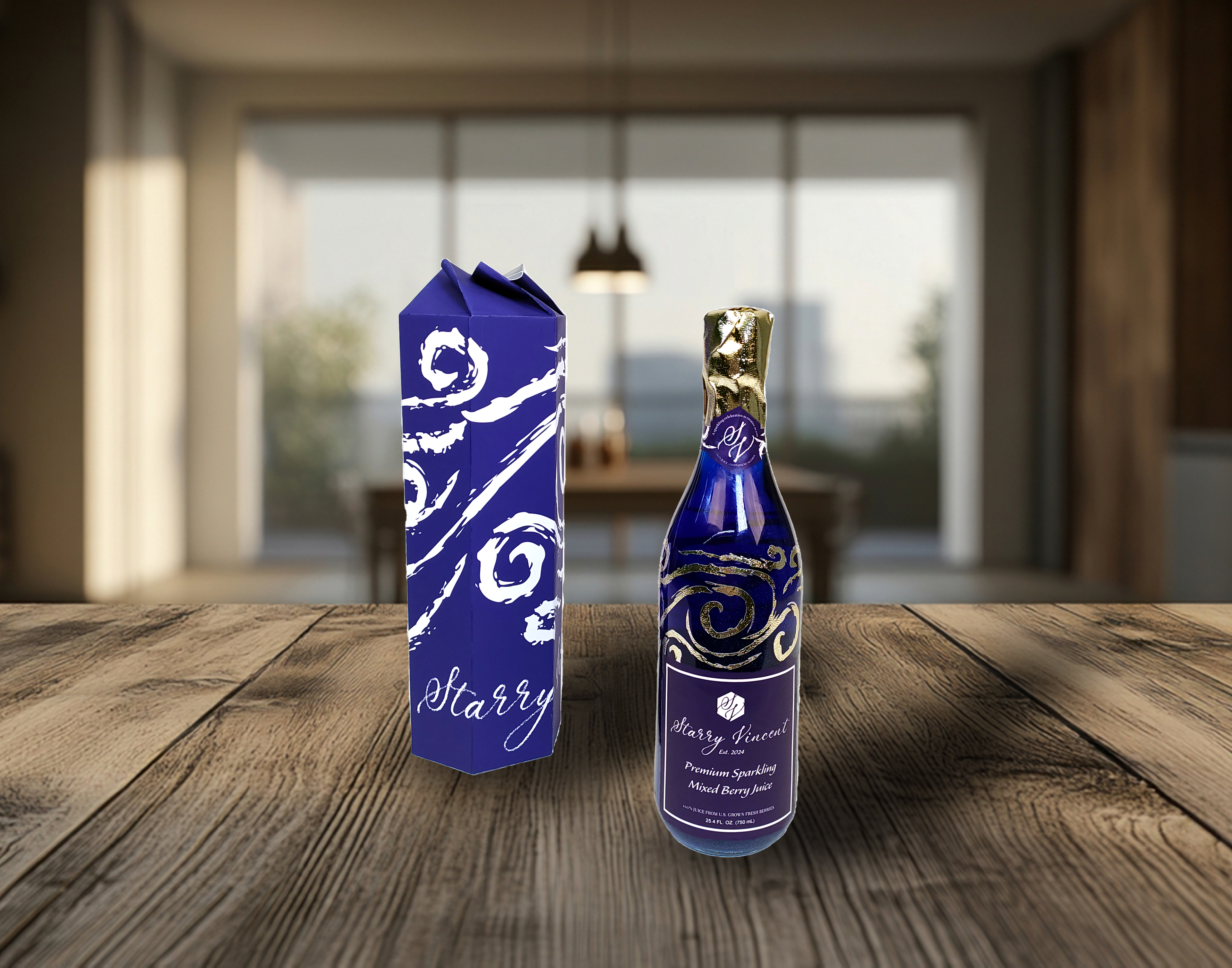
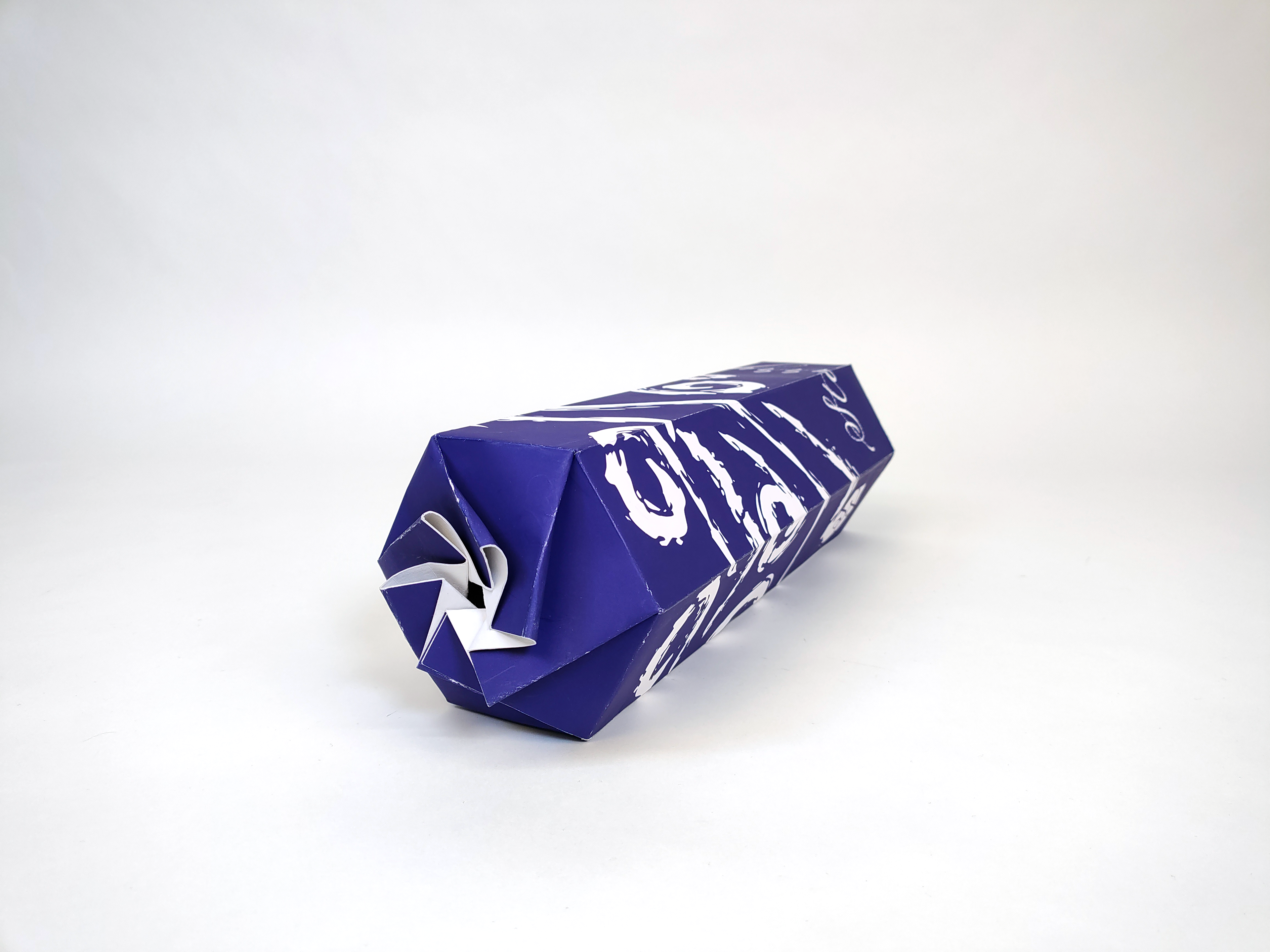
For the outside box that would contain the drink bottle, I was inspired by an origami pattern for a hexagonal box with a swirling closure, since the closure reminded me of the swirling brush strokes in Van Gogh's "Starry Night" painting. To tie in the box shape to the rest of the branding, I included a hexagon as the backdrop for the script monogram of the logo, followed by the full logotype in that same textured script font. This logo and hexagon shape is also featured on the bottle neck in the band covering the seam of the foil sealing the bottle.
For the Mixed Berry flavor, I created a repeating swirl pattern in reference to Vincent Van Gogh’s “Starry Night,” which I incorporated into the printed packaging. I cut out the same swirling pattern out of adhesive vinyl and added it to the bottle, using the same golden vinyl for the foil closure on top. Inside the bottle itself, I added mica powder to the drink so that when the bottle is swirled, the mica glitters inside, imitating the swirling graphics.
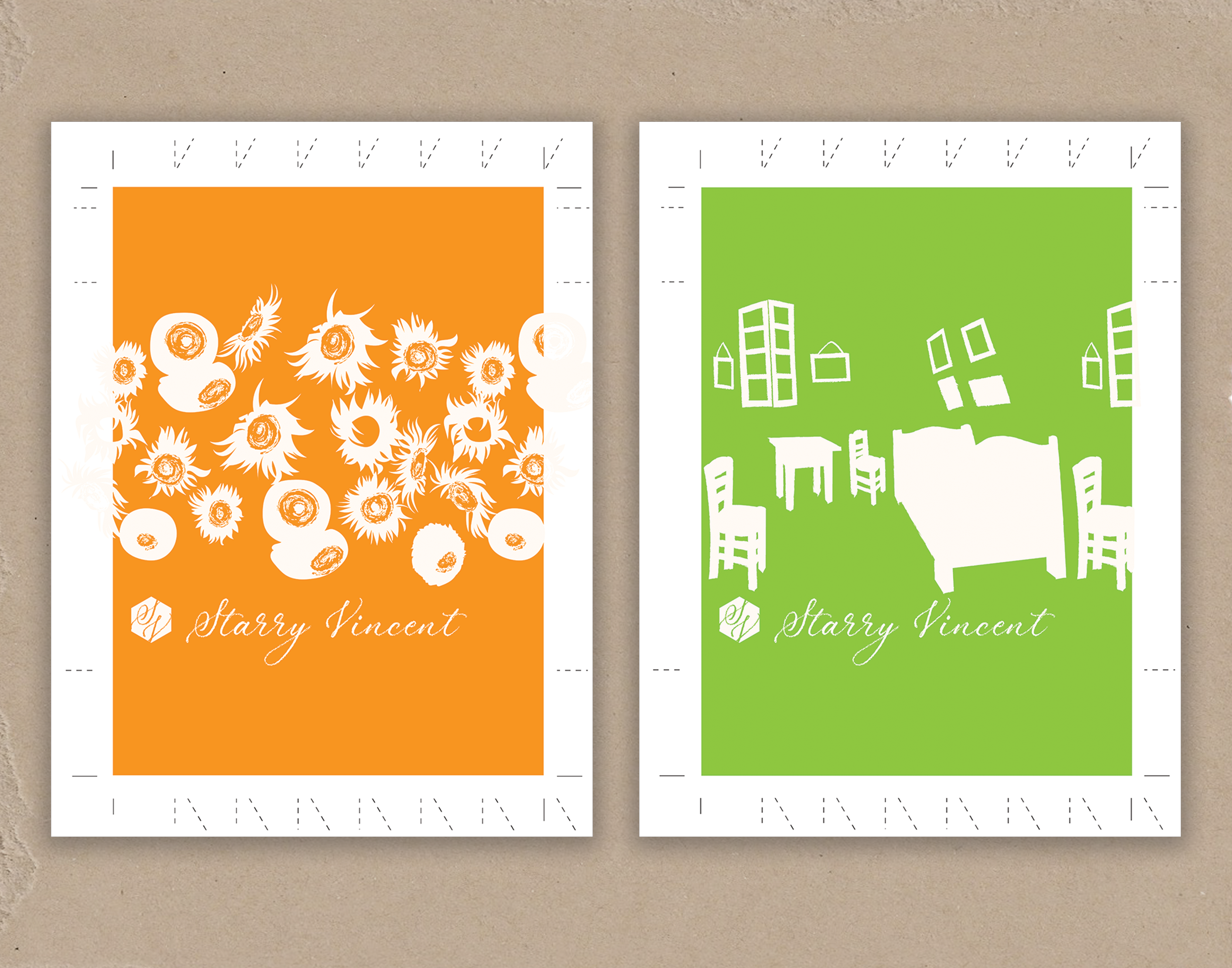
For alternate flavors, I designed two more unique repeating patterns based on Van Gogh's "Sunflowers" and "Bedroom" series of paintings. The background color of the box matches the color of the beverage, with all flavors keeping the common golden foil details and mica powder glitter in the drink. The bottle labels tie in the logo and colors from the packaging at a size that is clearly legible but also lets the glittering liquid and gold patterns catch the eye.