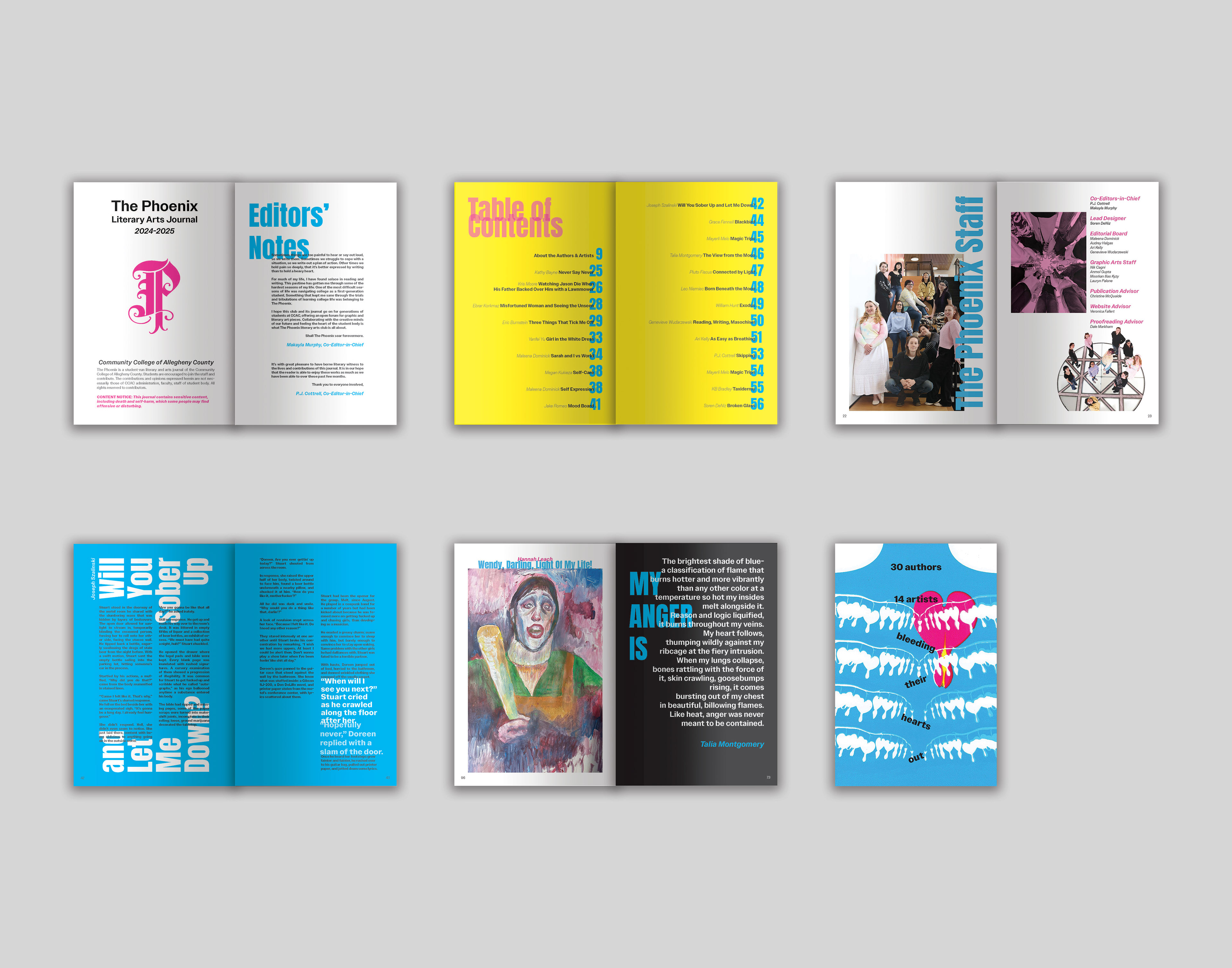
The Phoenix Literary Arts Journal is a publication created by a club of students at the Community College of Allegheny County. It features hand-picked writing and visual art pieces submitted by student, alumni, faculty, and staff at CCAC.
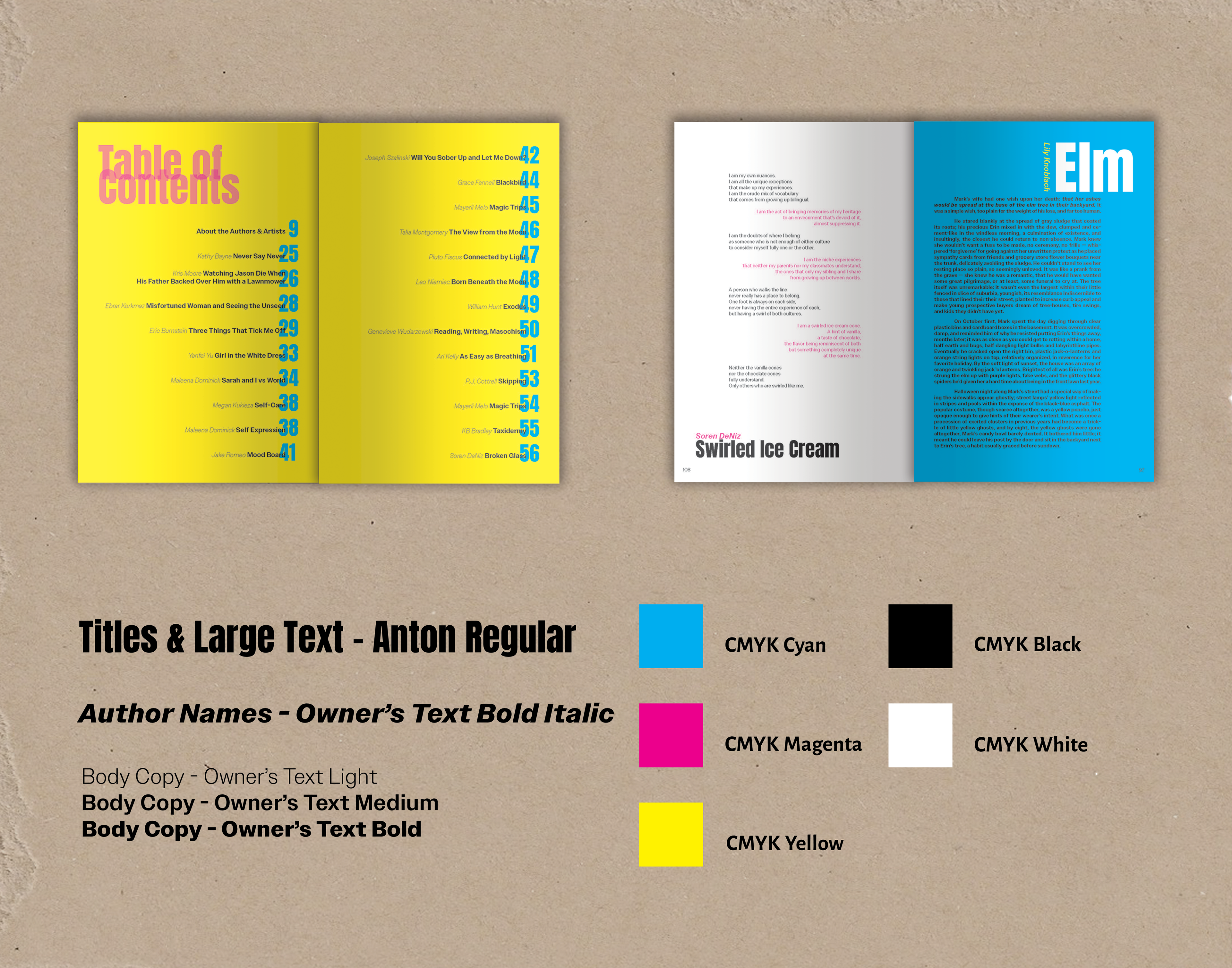
As Lead Designer of The Phoenix's 2025 edition, I collaborated with the editors, writers, and artists of the journal to design the printed publication in a way that complemented the submitted pieces. I developed project concepts, presented them to my colleagues, and adjusted the layout design based on feedback pertaining to dyslexic legibility, color blindness, and intentions of the writing and visual art. I was then responsible for leading a team of designers in laying out the internal pages based on my guidelines. I proofed all aspects of the publication design before the final publication design was sent to an external vendor for mass printing.
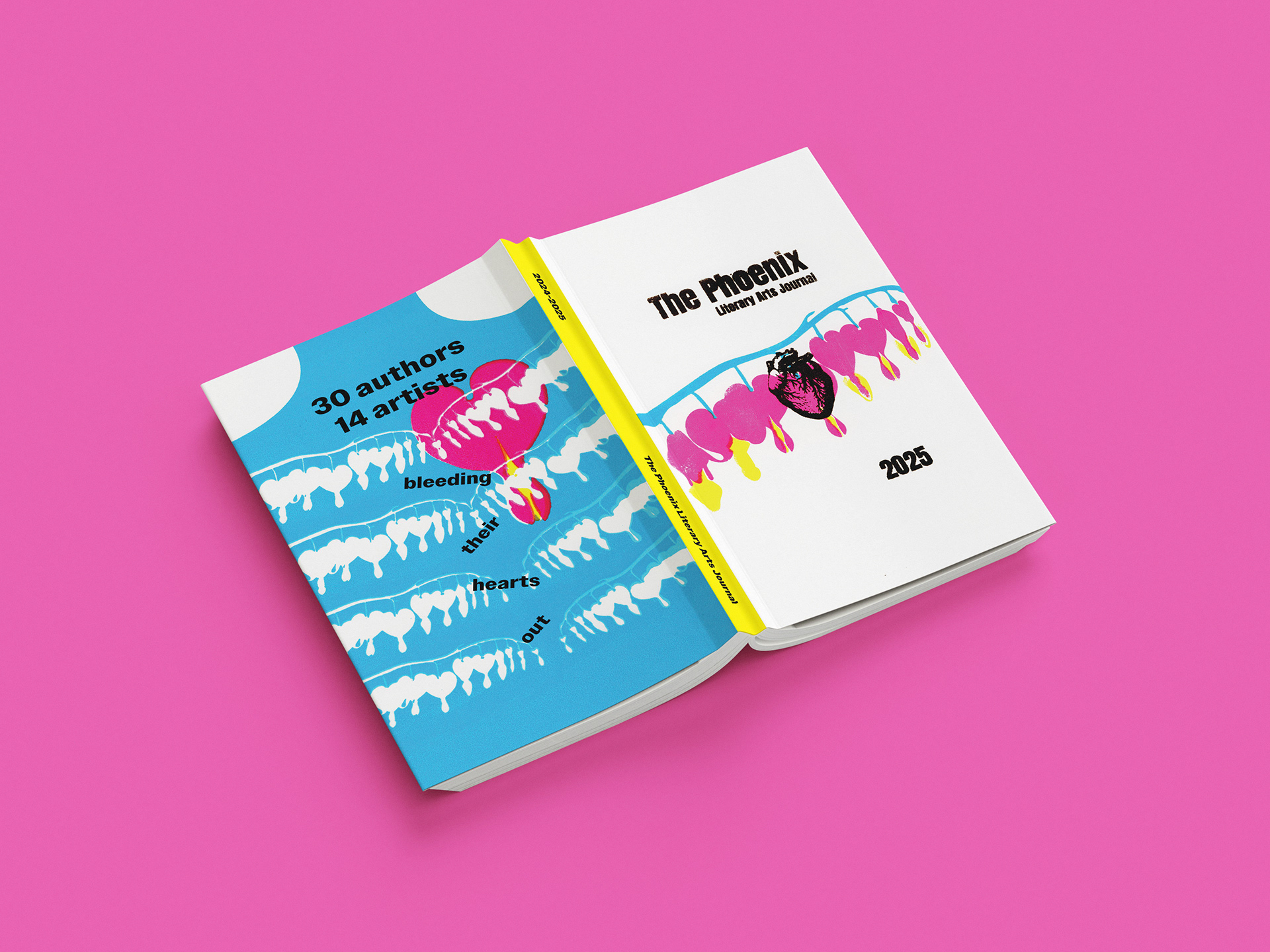
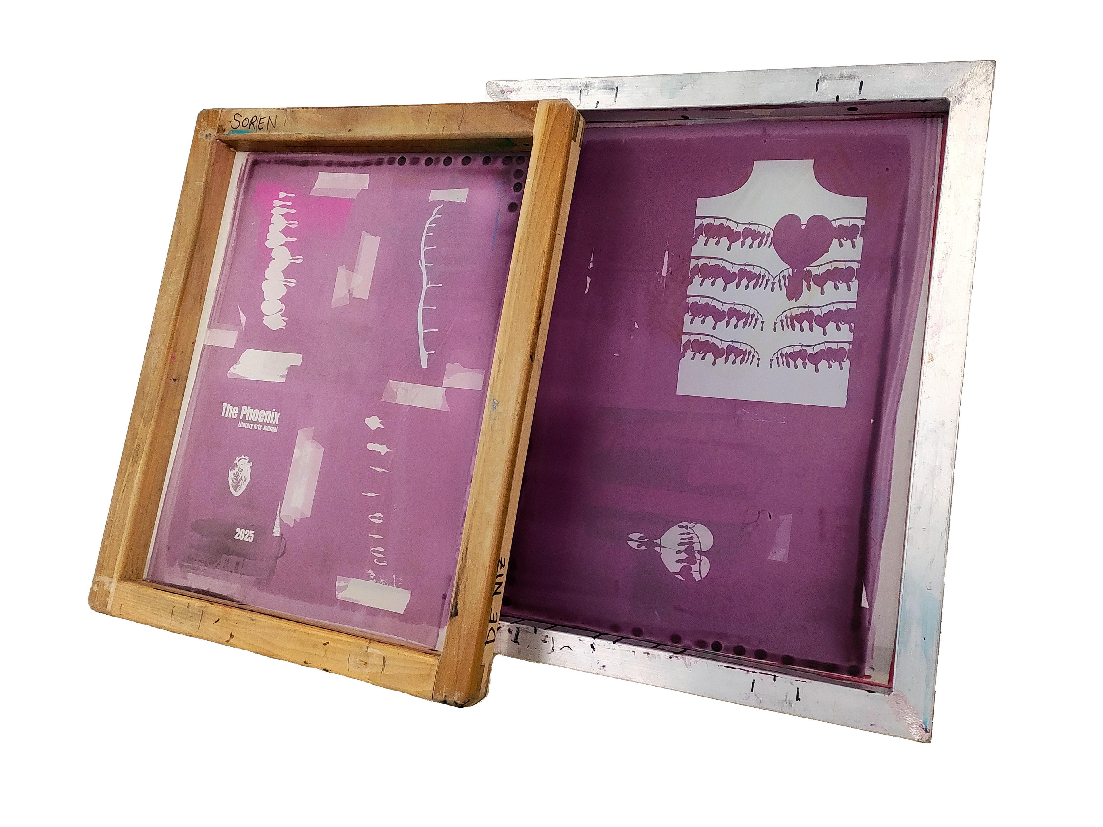
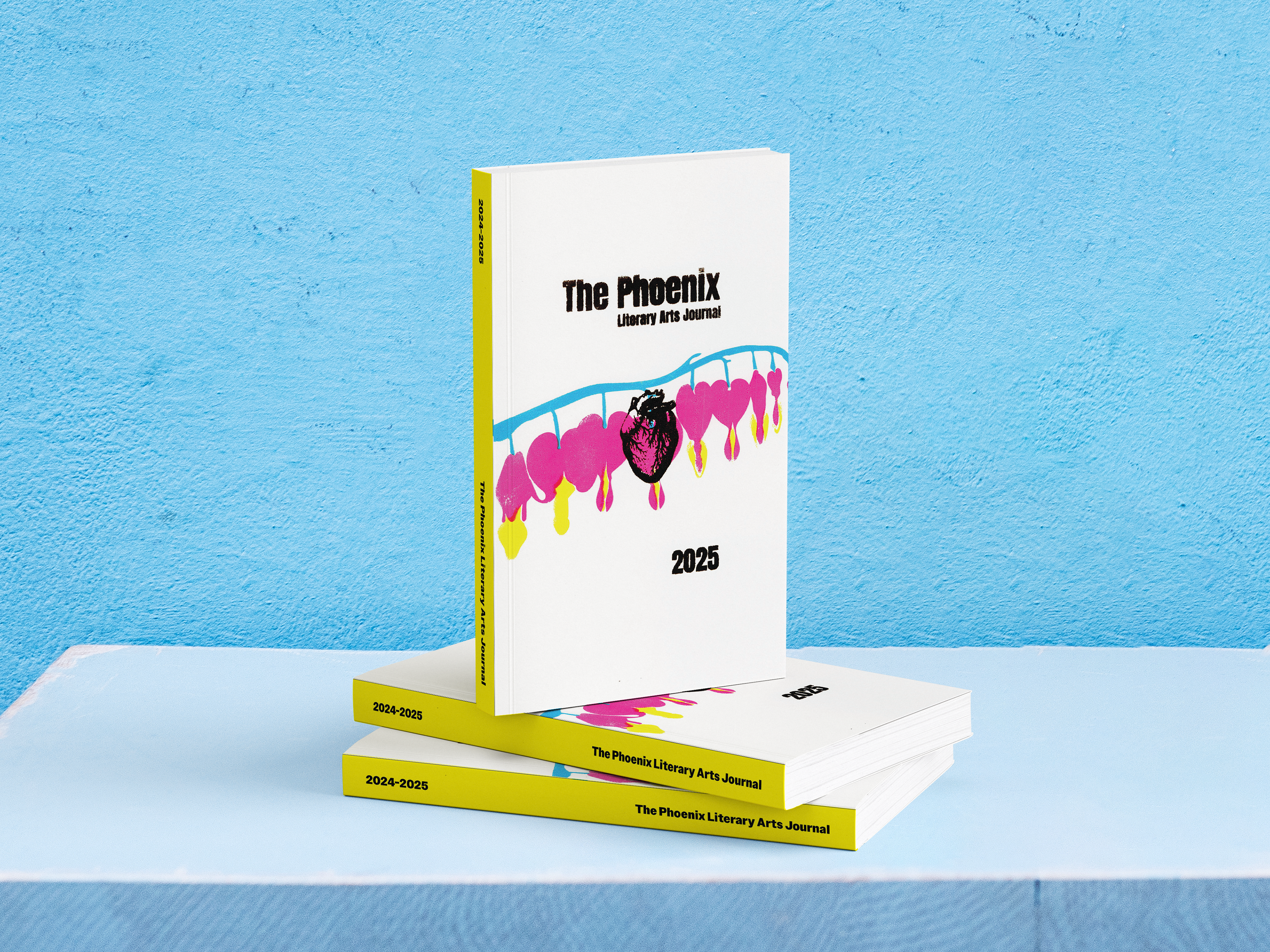
When initially sorting through the 2025 submissions, the editors-in-chief noted a common theme of many of the authors being vulnerable within their pieces, pouring a lot of pain and emotion into them. The editors pictured a bleeding heart as a metaphor for this emotional creative outpouring. I took that imagery, originally intended to be literal, and interpreted it as the bleeding hearts flowers, so named because of their silhouettes when they bloom.
I paired the image of the bleeding hearts flower with the bright, bold colors of cyan, magenta, and yellow to create visual contrast to the dark themes of the submission's contents. I picked the CMYK color scheme as a reference to the history of the screen printing medium which I used to design the cover. I physically burned the screens and manually printed the front and back cover designs, which I scanned into the final publication files to be mass printed.